Cromática Bench: New Parametric Furniture Concept!

My Inspiration: Carlos Cruz-Diez

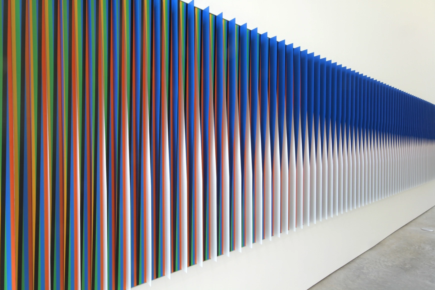
My bench design was inspired by the works of the French-Venezuelan visual artist Carlos Cruz-Diez (1923-2019). Cruz-Diez is a major protagonist in the field of Kinetic and Optical Art, a movement that encourages “an awareness of the instability of reality." In a lot of his 2D work, he explores the perception of color by juxtaposing coloured lines at various angles. Although Cruz-Diez uses solid colours, the angles of the lines create the illusion of a linear gradient.
A reason I took interest in Cruz-Diez's work for this project is that the simple, repeating forms seem to lend themselves well to parametric furniture design.

Since the 1960s, Cruz-Diez has created thousands of paintings, sculptures, murals, building facades, and installations. He has permanent public works all over Europe, Asia, Australia, and North and South America. He is considered "one of the most important color theorists of the 20th century and one of the most prominent figures of contemporary art."
I included a few of Cruz-Diez's works below:
 |
 |
| Carlos Cruz-Diez. Colour Additive Denise A. 2007. Chromography on aluminum, 180 x 80 cm. |


 |
| Carlos Cruz-Diez. Couleur Additive. 1974. |
 |
| The mural is 31484 sq. feet (2925 m2) |
Unfortunately, the mural has been vandalized over the years. Some Venezuelans have been stealing mosaic tiles from the mural before departing the airport. Apparently the tiles function as tokens of their last memory of Venezuela.
 |
| Vandalized Couleur Additive mural |
I find Cruz-Diez's work inspiring because it is not only inventive and aesthetically captivating, but it also has become part of the collective Venezuelan culture and experience.
Cruz-Diez's artwork has the power to make Venezuelans simultaneously feel nostalgia, cultural pride, heartbreak, and hope.
My Other Inspiration: Bauhaus
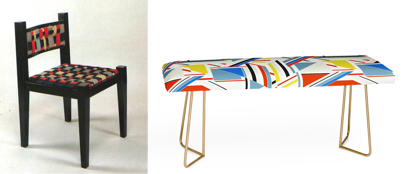
LEFT: Chair by Marcel Breur & Gunta Stolzl. RIGHT: Puzzle bench by Gabriela Fuente.
I find that the Cruz-Diez style of artwork is compatible with Bauhaus and European avant-garde furniture design. The saturated colours, geometric lines, and simple forms are present in both the artwork and furniture. So when I began designing my bench, I looked to the Bauhaus for inspiration.
Some of the Bauhaus principles from the 1919 manifesto that stood out to me are:
- Gesamtkunstwerk or the ‘complete work of art’. The Bauhaus strives to reunite arts and crafts – sculpture, painting, applied art, and handicrafts – as the permanent elements of a new architecture. Gesamtkunstwerk means a synthesis of multiple art forms such as fine and decorative arts.
- Minimalism. Bauhaus artists favoured linear and geometrical forms, avoiding floral or curvilinear shapes.
- Emphasis on technology. Bauhaus workshops were used for developing prototypes of products for mass production. The artists embraced the new possibilities of modern technologies.
- True materials. Materials should reflect the true nature of objects and buildings. Bauhaus architects and designers did not hide even brutal and rough materials.
 |
| Page from my sketchbook |
What sets my design apart?
Although my bench is inspired by Cruz-Diez and Bauhaus designs, it has a unique surface pattern, colour pallete, and fabrication approach. I am interested in exploring the parametric possibilities within these two styles.
Materials


 |
| Carlos Cruz-Diez. 1975/2017. Concordia Plaza, Paris. |

 |
| Routed samples of Valchromat |


Instead of being 40 inches, my scale prototype will be about 40 centimeters.
Designing the bench in Rhino
 |
| Chromatic seat pattern with black diagonal slats |
 |
| The same chromatic seat pattern but with white diagonal slats |
The first thing I designed in Rhino was the coloured pattern I wanted on the seat. I still can't decide which I like more: the pattern with the black slats or the pattern with the white slats.

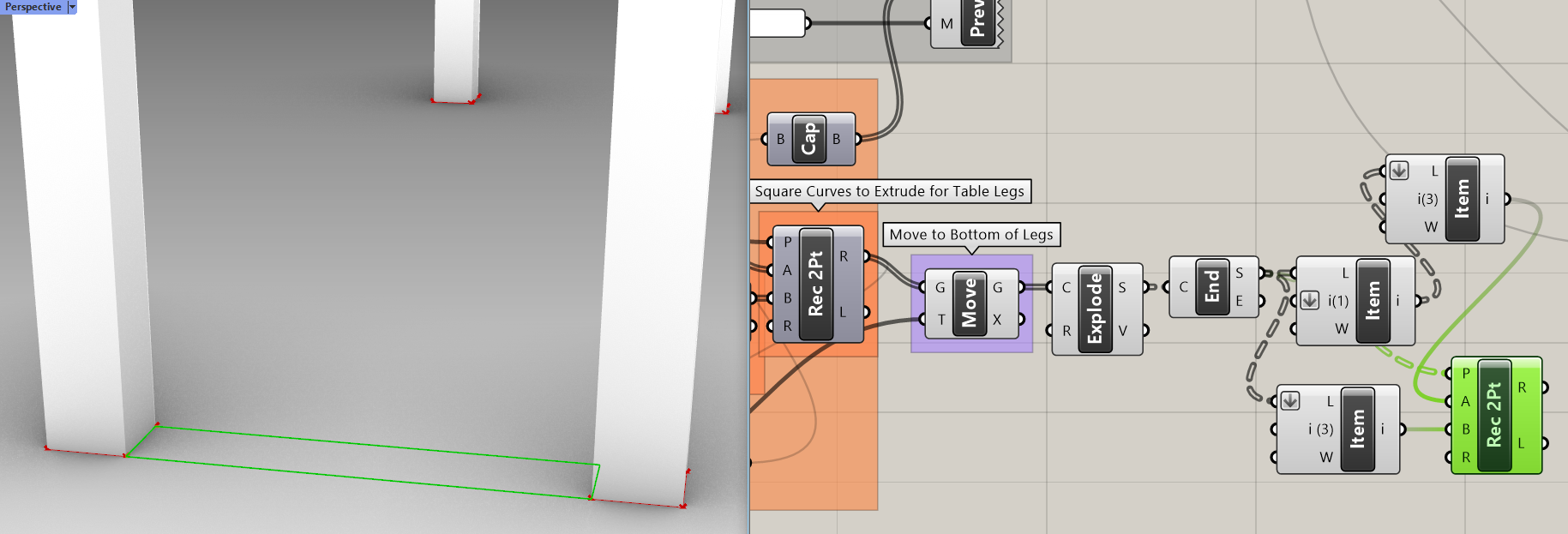
After I completed the seat pattern, I began to design the legs and the rest of the bench. To create a more harmonious design, I made the bench legs by extending the diagonal slats and bending them down at 90°. I intend to make the bench structure an extension of the artwork on the seat.

Reconstructing the Seat Pattern in Grasshopper

 |
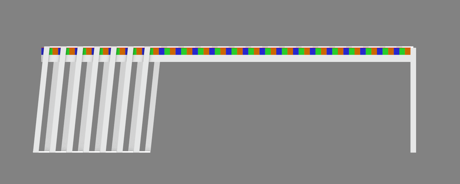
| The rectangular base and the slat array weren't aligned |
I ended up making two definitions for the seat pattern because the first one ended up being a bit overcomplicated. Last class, Bryan showed me a simpler approach for this definition.
In my first definition, I tried making the seat pattern using extruded forms.
I began by making a vertical slat array for the seat area (those slats were meant to be the coloured strips) and each piece was 2cm wide. The slats lay on top of a solid rectangular base. When I adjusted the sliders for the dimensions of the base, the slat array adjusted to cover the length and width of the base. Since the slats had a fixed width at 2cm (0.787in), they didn't align perfectly with the base length in the x-direction. I was stuck because I didn't know how to make a slider for the base length increase by 0.787in increments at a time.

I ended up figuring out the solution, which was to write a custom expression in the slider edit panel. I had to write '0.787x' in the expression field to make the rectangular base increase in intervals of 0.787in. After figuring this out, I realized that I had new challenges.
I wasn't sure how to incorporate the diagonal slats like I had in Rhino. For the colour illusion to work, the midpoint of the bottom edge of the diagonal slat needs to be between the blue and green slats and the midpoint of the top edge of the diagonal slat needs to be between the orange and blue slats. It sounds really complicated (it's not) but it's just hard to describe in words!

Last class, Bryan suggested that instead of creating the pattern with extruded forms, I complete the pattern in 2D and extrude it after. This process is also way more convenient because I need a 2D pattern for the laser cutter. So, I began to work with a second, improved definition.
The second definition also started with a linear array of rectangular slats. But instead of extruding them, I deconstructed them using explode and list item objects (Bryan showed me this). Deconstructing these rectangles allow me to use their points to fix the new diagonal slats to their correct position. So if I were to modify the dimensions of the vertical slats, the diagonal ones would adjust accordingly while keeping their position.

Once all the slats were in place, I tried to use Region Difference to eliminate the overlapping sections. I wanted the diagonal slats to cut and eliminate the edges of the vertical slats. However, nothing was happening when I used the Region Difference object.


I used Region Difference and Region Intersection to turn the coloured slats into a puzzle piece of sorts. No surface overlaps and all the pieces fit together.


Then I made a new red layer with all the curves for the laser cutter.


Constructing the Rest of the Bench in Grasshopper


 This is what the bench looks like with four identical legs. Although this isn't the design I had originally envisioned, I like it as well. I think it looks clean and more minimalistic. The view from the side is quite nice. I am still going to try to make the original design I had pictured and see which one I like best. My original design is challenging for me to make because it has legs extending from a portion of the seat pattern. I have to find a way to integrate the seat pattern with the legs in a way that is aesthetically pleasing but structurally sound.

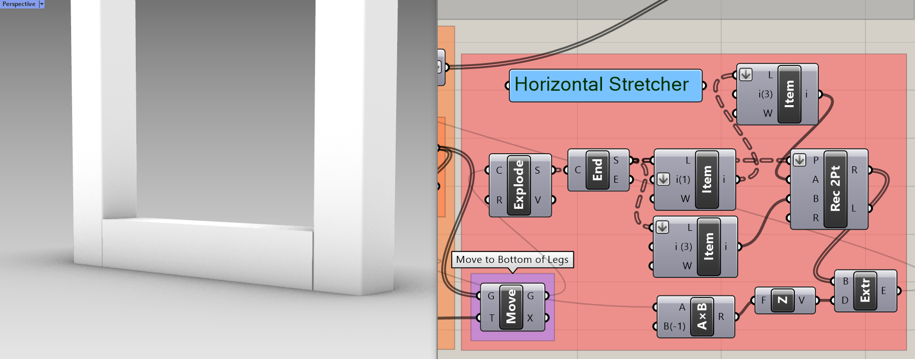


The relay basically acts as a wire tie to join wires coming out from the same input or output. I made this example on the right to show what I mean. As you can see, relays can help prevent cluttered definitions in the long run.
The relays, wire display modes, and colour coded groups have helped me keep track of the objects in my definition. Every time I've made a new section in my definition (solid wood board, legs, stretcher, etc.), I have had to connect it to many objects from the beginning of the definition (2D & 3D Chromatic Seat Pattern). If my work hadn't been organized, it would've been very difficult for me to create the definition at all.
Introducing the Cromática Bench

.

.


.

.
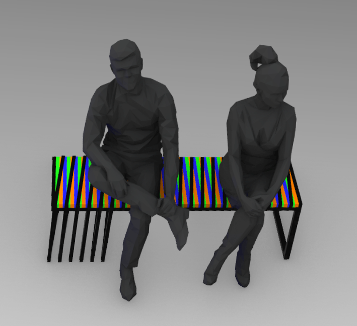
When viewing from certain angles, the legs become a perfect extension of the black lines from the seat pattern. It's a perspective-based illusion :D


My next blogpost will include images of the physical mini-scale model. Stay tuned :)


Daniela this is amazing!! Great artist inspiration too, I am going to look into this artist some more. You are so talented and I hope I get to sit on this bench someday, absolutely stunning work.
ReplyDeleteThank you so much Jess! I'm nervous but also looking forward to making the bench. And I am glad you found Cruz-Diez's work interesting, he's one of my favourite artists :)
DeleteI still can't get over how cool this pattern looks, great work!
ReplyDeleteReally cool pattern! I loved the animation of it, really helped me see how the pattern was made.
ReplyDeleteThis is so great. I love how you took your inspiration and ran with it and made it your own. Beautiful.
ReplyDeleteI love how you have a clear plan for everything step you plan to take along the way, and how you ended up creating a completely different piece compared to your last post. I feel like you completely made an amazing new concept, I cant wait to see how you execute the scale model!
ReplyDeleteCombining art and furniture is such a growing field I definitely see this design in many homes of the future! I didn't notice the first time I saw this but I love the way the legs appear to be an extension of the coloured line on top, just continued down. That's a very interesting visual moment. I wonder if you could push that further and make other legs the other colours that also cary down? But then again I like how it looks now.
ReplyDeleteLooks really cool. and it shows that you put a lot of thought and work into making this design. It'd be a really nice statement piece or set of public benches.
ReplyDeleteThis is an amazing amount of work, the documentation you've put into your process is top notch! The final design clearly reflects your inspiration and it is very successful on its own merits as well. Phonomenal!
ReplyDeletewow! It looks like a piano chair? I like how you decorated and color choices! Amazing art works!
ReplyDeleteThis chair is well designed, the introduction and background are also well presented. I have to say that your works never let us down, good work, Daniela.
ReplyDeleteLove everything you done in here! Your design is like a chair documenting the shape of light and rainbow! I also appreciate the artist you choose as your inspiration. Great job
ReplyDeleteI really appreciate the amount of research you have done! I am really really (x 100) excited to see you build this in real life!
ReplyDeleteI love this piece, I think that my favourite part is probably the multiple supports that you have on the one side of the bench! I can definitely see this in both a personal and professional setting!
ReplyDelete